Colour is the first visual element that attracts attention in any creative, even before text or images are processed by the brain. When a user scrolls through social media or views an advertisement, their decision to pause or skip is often influenced by colour. A strong and well-chosen logo colour can immediately create a positive impression and make the brand appear professional and trustworthy. On the other hand, dull or mismatched colours may fail to grab attention or may even create confusion about the brand’s identity.
Where users are exposed to hundreds of ads daily, first impressions matter significantly. A distinctive logo colour helps in standing out from the crowd and increases the chances of engagement. Therefore, selecting the right colour is not just a design choice but a strategic decision that directly impacts how a brand is perceived at first glance.
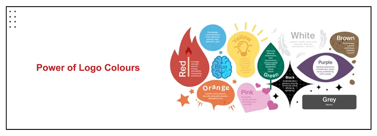
Colour Influences Human Psychology
Colours have a strong connection with human emotions and behavior, making them a powerful tool in branding and marketing. Different colours trigger different psychological responses, which influence how users perceive a brand. For example, blue is commonly associated with trust and reliability, making it ideal for financial and corporate brands. Red, on the other hand, creates excitement and urgency, often used in sales promotions. Green represents growth, nature, and health, while black signifies luxury and sophistication.
When a brand carefully selects its logo colour, it aligns its identity with the emotions it wants to evoke in its audience. This emotional connection plays a crucial role in decision-making, as people are more likely to engage with brands that resonate with their feelings. By understanding colour psychology, businesses can design creatives that not only attract attention but also influence user perception and behavior effectively.
Builds Strong Brand Recognition
Consistent use of logo colour is essential for building strong brand recognition. When users repeatedly see the same colour associated with a brand, it becomes easier for them to identify it instantly, even without reading the name. Over time, this consistency creates a strong visual memory, making the brand more familiar and trustworthy.
Where users are constantly exposed to new content, recognition plays a key role in engagement. A consistent logo colour ensures that every creative reinforces the brand identity. For example, when a brand uses the same colour palette across ads, social media posts, and websites, it creates a cohesive visual experience. This consistency helps in building recall and increases the likelihood of users interacting with the brand. Ultimately, strong recognition leads to higher engagement, better conversions, and long-term customer loyalty.
Enhances Visual Appeal in Creatives
Logo colour significantly contributes to the overall visual appeal of a creative. A well-chosen colour scheme creates harmony, balance, and contrast, making the design more attractive and engaging. When the logo colour complements other elements such as background, text, and images, it enhances the overall aesthetic quality of the creative.
In contrast, poor colour combinations can make the design look cluttered or unprofessional, reducing its effectiveness. For example, using too many colours or choosing shades that clash can distract users and weaken the message. A clean and balanced design, supported by the right logo colour, ensures that the creative is visually appealing and easy to understand. In digital advertising, where attention spans are short, a visually attractive creative can significantly improve engagement and performance.
Improves Ad Performance and Engagement
Logo colour plays a direct role in influencing how users interact with ads. Creatives with strong and consistent branding are more likely to attract attention and build trust. When users recognize a familiar colour, they are more likely to pause and engage with the ad.
Colours also help in highlighting key elements such as call-to-action buttons, offers, or product features. For example, contrasting colours can make important elements stand out, increasing the chances of clicks. Additionally, certain colours are known to trigger specific actions, such as red for urgency or green for positive decisions. By strategically using logo colour in creatives, businesses can improve click-through rates, engagement levels, and overall campaign performance.
Reflects Brand Personality and Values
Logo colour is a reflection of a brand’s personality and core values. It communicates what the brand stands for without the need for words. For example, a brand using earthy tones may represent sustainability and eco-friendliness, while a brand using bold and vibrant colours may convey energy and innovation.
Choosing the right colour ensures that the brand message is clear and consistent across all touchpoints. In creatives, this consistency helps in building a strong identity that resonates with the target audience. When users understand a brand’s personality through its visual elements, they are more likely to connect with it. This connection strengthens brand positioning and makes the business more memorable in the minds of consumers.
Creates Emotional Connection with Audience
Colour has the ability to evoke emotions and create a deeper connection with the audience. When users associate positive feelings with a brand’s colour, they are more likely to trust and engage with it. For example, warm colours like yellow and orange can create feelings of happiness and excitement, while cool colours like blue and green can create a sense of calm and reliability.
This emotional connection is essential for building long-term relationships with customers. By consistently using logo colours that evoke the desired emotions, brands can strengthen their connection with the audience over time. This not only improves engagement but also increases customer loyalty and brand preference.
Supports Consistency Across Platforms
Maintaining consistent logo colour across all platforms is essential for building a unified brand identity. In today’s digital environment, brands interact with users through multiple channels such as social media, websites, and advertisements. Consistent use of colour ensures that users have a seamless experience across all these platforms.
When the same colour scheme is used everywhere, it reinforces the brand identity and builds trust. Inconsistent use of colours, on the other hand, can confuse users and weaken the brand’s image. Consistency also makes it easier for users to recognize the brand across different platforms, increasing engagement and recall. Therefore, maintaining colour consistency is a key aspect of effective branding and marketing.
Helps in Differentiation from Competitors
In a competitive market, differentiation is crucial for success. Logo colour can act as a powerful tool to set a brand apart from its competitors. When a brand uses a unique and distinctive colour, it becomes more noticeable and memorable.
If multiple competitors use similar colour schemes, choosing a different colour can help a brand stand out. This uniqueness not only attracts attention but also creates a strong identity in the minds of consumers. In digital advertising, where users are exposed to numerous ads, a distinctive logo colour can make a significant difference in capturing attention and driving engagement.
By using colour strategically, brands can create a unique presence that differentiates them from others and strengthens their position in the market.
Conclusion
Logo colour is more than just a design element; it is a powerful tool that influences perception, emotion, and behavior. From creating strong first impressions to improving ad performance and building brand recognition, the impact of colour is significant.
Businesses that carefully choose and consistently use their logo colours in creatives can achieve better engagement, stronger brand identity, and higher conversions. In a highly competitive digital landscape, understanding and leveraging the importance of logo colour is essential for long-term marketing success.
Frequently Asked Questions (FAQs)
Q1. Why is logo colour important for branding?
Ans. Logo colour is important because it creates the first impression and helps people recognize a brand instantly. It builds identity, improves recall, and communicates the brand’s message without words. A consistent colour also makes the brand look professional and trustworthy.
Q2. How does colour affect customer perception?
Ans. Colours influence emotions and behavior. For example, blue creates trust, red creates urgency, and green represents growth. The right colour helps customers feel connected to the brand, which increases engagement and improves buying decisions.
Q3. Can logo colour impact ad performance?
Ans. Yes, logo colour can directly impact ad performance. A strong and consistent colour helps ads stand out, grab attention, and increase click-through rates. It also improves brand recognition, which leads to better engagement and conversions.
Q4. What is the best colour for a brand logo?
Ans. There is no single best colour. The ideal colour depends on the brand’s industry, target audience, and message. For example, blue is suitable for finance, green for health or eco brands, and black for luxury brands.
Q5. Why is consistency in logo colour important?
Ans. Consistency helps in building strong brand recognition. When the same colour is used across all creatives, it creates a unified brand identity and makes it easier for customers to remember and trust the brand.
Q6. How does logo colour help in differentiation?
Ans. A unique logo colour helps a brand stand out from competitors. If competitors use similar colours, choosing a different colour can make the brand more noticeable and memorable in the market.
Q7. Does logo colour affect emotional connection?
Ans. Yes, colours create emotional responses. When a brand uses colours that match its message, it builds a deeper emotional connection with the audience, which increases loyalty and trust.
Q8. Should logo colour be the same across all platforms?
Ans. Yes, maintaining the same logo colour across social media, ads, and websites ensures consistency. This helps in building a strong and recognizable brand identity.
Q9. Can changing logo colour affect brand identity?
Ans. Yes, frequent changes in logo colour can confuse customers and weaken brand recognition. If a change is necessary, it should be done carefully and consistently across all platforms.
Q10. How can businesses choose the right logo colour?
Ans. Businesses should consider their target audience, industry trends, brand values, and psychological impact of colours. Testing different colour options and analyzing user response can also help in making the right choice.